Examples
We have assembled a number of examples to show you how to use some of Easy
GUI's most powerful features. The examples are located in the \projects\Examples\
subdirectory of the Amulet main directory. By default, the Amulet main directory
is C:\Program Files\Amulet, however you may have specified a different path
during the install.
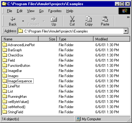
Each example project is contained in its own subdirectory and
each contains at least two html files:
- CompileMe.htm -- This is the source code for the Easy GUI example project.
It is intended to be compiled by the HTMLCompiler and programmed into your
Easy GUI module's onboard FLASH.
- ReadMe.htm -- This
browser viewable description explains how the CompileMe.htm file works.
Feel free to use any of these pages as templates for your own GUI. Just copy
the appropriate pages to your own subdirectory in \projects\ .
Control Widgets
The group of visual controls that accept user input are called Control Widgets.
Examples are list widgets, slider widgets, radio buttons, checkboxes and function
buttons. The following examples illustrate how to use these control widgets
to (1) remotely control another microprocessor via the serial port, (2) control
other widgets on the same page, or (3) control navigation to other pages.
|
|
|
|
Check Box
A checkbox is a labeled, square box used to invoke a function (or set
of functions) whose argument is the value of the checkbox. This example
features a checkbox that changes the update rate of a lineplot widget.
|
|
|
|
|
Custom Button
Custom buttons are Amulet anchors that are comprised of two different
images, a pressed and a not pressed. They can be set up either as
a "spring-loaded" or a "toggle" button. This example
has a line plot widget which is tied to a slider widget using Inter
Widget Communication. There is also a "toggle" styled
custom button which looks like a light switch. The light switch can
be either turned "on" or "off". Initially, the
light switch is in the "on" position, and the line plot
is updating. When the custom button
is pressed, it moves to the "off" position and the line plot
stops updating.
|
|
|
|
|
Custom Slider
Custom Slider Widgets act the same as traditional sliders except you
get to determine the handle image, both pressed and released, and
the background image on which the handle travels. This particular
example uses a sailboat sailing on a sea as the custom slider.
To show the functionality of the Custom Slider, the InternalRAM
variable that is set is also used as an input to a Linear Gauge
Widget. The Linear Gauge is equally as whimsical, with an aquarium
as the background image and a fish as the pointer icon which travels
vertically up and down the aquarium.
|
|
|
|
|
Function Button
Function buttons are Amulet anchors that can have the visual appearance of
either a "spring-loaded" or a "toggle" button image. This example is made up of two
pages. The first page has two "spring-loaded" buttons on the bottom. The bottom left button
sends a command out the serial port. The bottom right button hyperlinks
to the second page. The second page has a button on the bottom that forces
a return to the calling page. This is not a direct jump, it is similar
to the backup button on an internet browser.
|
|
|
|
|
List
The List Widget creates a list of selectable text objects that share a
common function (or set of functions) and are vertically aligned
in a box. The list widget in this example is tied to an image sequence
widget via Inter Widget Communication. Depending upon the list entry
selected, the image sequence will display a unique bitmap image without jumping to
a new page.
|
|
|
|
|
Radio Buttons
A radio button is a labeled, round button used to make a single selection
from several options. This example is actually the same example as the
bargraph example. The radio buttons allow the user to specify whether
the bargraph is updated via UART requests, or via an on screen slider
widget.
|
|
|
|
|
Slider
The Slider Widget invokes a function (or set of functions) upon pen down.
The argument is determined by the location of the handle and the limits
setup with the min and max attributes. This example is actually
the same example as the bargraph example. The slider is used to change
the value displayed by the bargraph.
|
View Widgets
View Widgets are used for displaying data. View Widgets include bargraphs,
image sequences, lineplots, and string fields. The following examples show various
views of the same byte value received from a serial port request. Additionally,
most of the examples also feature one of the above control widgets that can
optionally control the byte value viewed via the view widget.
|
|
|
|
Bargraph
A Bargraph Widget is a live bargraph that represents the byte (or word)
value returned from a function call. The bargraph moves from left-to-right,
right-to-left, bottom-to-top, or top-to-bottom. This example features
a bar graph that fills from left to right with a "brick wall"
pattern.
|
|
|
|
|
Dynamic Image
A Dynamic Image Widget allows for the uploading of images, serially, at
runtime. This example allows you to upload one of two different images using
the Windows terminal program, HyperTerminal.
|
|
|
|
|
Image Bar
The Image Bar Widget uses two images (empty bar and full bar) to create
a custom "bargraph". Based upon the value being displayed, a
percentage of the empty bar and a percentage of the full bar are displayed.
The custom bar graph creates the illusion of a glass of wine with a linearly
variable volume.
|
|
|
|
|
Image Sequence
The Image Sequence Widget is similar to an animated bitmap. However, instead
of being linked to a timer event, the transition between images is linked
to a byte (or word) returned from an href function call. This example
is similar to that of the list widget. The byte value returned by
the UART/Slider determines which unique bitmap image of six is displayed
by the image sequence widget.
|
|
|
|
|
Line Plot
The Line Plot Widget is a live line plot that represents a byte (or word)
returned from an href function call. The line plots from left-to-right
and continuously wraps. This example shows a single line plot that is
updated by either the UART or a slider.
|
|
|
|
|
Linear Gauge
The Linear Gauge Widget is comprised of a background image and a pointer
icon whose position is determined by a byte (or word)
returned from an href function call. The pointer icon can be
set up to travel horizontally or vertically along the background
image. This example shows a horizontal linear gauge which is
updated by a slider.
|
|
|
|
|
Numeric Field
The numeric field can display a mixture of static text and a live number.
The string is input using the standard C printf format. This is an enhanced
version of the bargraph example. We added a numeric field just above the
bargraph to show the percentage of bargraph fill.
|
|
|
|
|
String Field
The String Field Widget calls a function that returns either a null-terminated
string of ASCII characters, or a one-byte index into a list of pre-built
strings. This example shows both variations. The top half of the LCD displays
a string returned from a serial port request. You can use the included
Amulet Protocol Simulator to vary the string
displayed on the LCD. The bottom half of the LCD has a list widget that
changes the byteValue of the string field to control which of the predefined
strings to display.
|
Control Objects
The group of visual controls that can be entered using standard HTML are called Control Objects.
Examples are anchors, area maps and META Refresh tags. The following examples touch
on how to use these control objects.
|
|
|
|
Anchors
A series of six different examples all using the <A> anchor tag.
Anchor tags are used to hyperlink to other pages as well as launch
Amulet functions.
In the Image folder, an anchor is placed around an image. In
the ONTIME folder, an anchor is given the ONTIME attribute, which
triggers the anchor after a given amount of time. In the Text folder,
an anchor is placed around static text. In the trigger folder, an
anchor is given the ONVAR attribute, as well as the trigger attribute,
in order to trigger the anchor based upon an external variable
equaling the trigger value. In the trigger.gt folder, an anchor
uses the trigger.gt attribute to trigger the anchor based upon an
external variable being greater than the trigger value. In the trigger.lt
folder, an anchor uses the trigger.lt attribute to trigger the anchor
based upon an external variable being less than the trigger value.
|
|
|
|
|
Meta Refresh Tags
A series of four different examples all using the Meta Refresh tag.
Meta Refresh tags can be thought of as invisible anchors that are
not present on the LCD, but they can be triggered via timer, via
an ONVAR trigger or they can be forceHit() to launch their
function(s). All of the examples require the use of the Amulet Simulator
to fully test them out.
|
Inter-Widget Communication
These examples feature advanced UI techniques that utilize communications between
on screen objects. Inter-Widget Communications (IWC) give Amulet widgets the
ability to invoke the methods of other Amulet widgets. (See Appendix
B for a comprehensive listing of all available widget methods.)
|
|
|
|
Running Man
This example uses radio buttons to call the various methods of an animated
GIF object. The methods affect the playback of the animation, giving it
VCR like controls.
|
|
|
|
|
Advanced Line Plot
The lineplot in this example is manipulated by two separate onscreen controls:
An update rate selection list, and a start/stop button.
|
|
|
|
|
fileNumber()
This example implements a Jump Menu. There is a list
widget which gives the user a choice of pages to jump to, and a "go"
button which gives the user a chance to confirm the choice before performing
the jump to the selected page. It uses the Amulet:fileNumber() function
to launch to the various pages. Each page has an Amulet:internal.fileNumber.value()
function in it to display the value of its internal page number.
This example makes use of the Amulet Link Map and the initInternalRAM
Meta Tag and Internal RAM variables.
|
|
|
|
|
setMethod()
This example shows how one Control Widget (a radio button) can set another
Control Widget's (a function button) href method. The function button
beneath the line plot invokes a method to
make the line plot either disappear or reappear. The radio buttons control which method
is sent by invoking the setMethod() method of
the function button.
|
|
|
|
|
setUpdateRate()
This example shows how one Control Widget (a radio button) can set a
View Widget's (a line plot) updateRate parameter. This example requires
the use of the Amulet Simulator.
|
|
|
|
|
setValue()
This example implements a Jump Menu. There is a list
widget which gives the user a choice of pages to jump to, and a "go"
button which gives the user a chance to confirm the choice before performing
the jump to the selected page. This same technique can be used to allow
the user to confirm a variable change before sending it out the UART.
Also exploited here is a technique that forces a page jump via the value
of an internal or external variable.
|
|
|
|
|
setX()
This example shows how the setX() and setY() methods can be used to
move a widget/object on the display at run time.
|
Miscellaneous
These examples are varied in their scope. They show how to use some of the
special features of the Amulet Easy GUI.
|
|
|
|
Calibrate
This example shows how to use the href function call Amulet:calibrate()
to launch the touchscreen calibration routine via software, as opposed
to dealing with the calibration DIP switch.
|
|
|
|
|
CCAd
This example is one used in an advertisement located in Circuit Cellar
magazine. It's a lineplot that uses a random byte value as its input
and can be stopped by touching a STOP image. There are tabs which
adjust the plot tick marks.
|
|
|
|
|
CustomOS
This example shows how to combine a RAW AmuletOS file and a .uht
project file using a .AmuletOS file to create a "production
ready" custom OS. It also shows how to use the LCD Settings
menu to load a custom LCD type as part of your custom OS.
|
|
|
|
|
Factory
This is a sample user interface which you might see in an industrial
setting.
|
|
|
|
|
InitInternalRAM
This example shows how to initialize InternalRAM variables at compile
time.
|
|
|
|
|
InternalRAM
This example shows how to use Amulet's Internal RAM as an input to a
View Widget, as an output from a Control Widget, and how to save
the contents of Internal RAM to the serial data flash.
|
|
|
|
|
Keyboard
This example shows how to use Amulet's Internal RAM strings as a means
of creating a keyboard. This example lets you change the name of
six individual buttons at runtime. The changes are saved to the
serial data flash, so cycling the power will not affect the button's
labels.
|
|
|
|
|
Macro Preprocessor
This example shows how to use Amulet's Macro Preprocessor.
|
|
|
|
|
SlotMachine
This is an example of a slot machine that we had on display during the
2001 Embedded Systems Conference West.
|
|
|
|
|
SpiContrast
This example shows how to use a couple of sliders to adjust the SPI-based
contrast and backlight digital pots. This example requires an Easy
GUI module with SPI-based digital pots installed.
|
Amulet HTMLCompiler,
Copyright © 2000-2004 by
Amulet Technologies, LLC
Back to Welcome - Contact
Amulet - Amulet
Home